

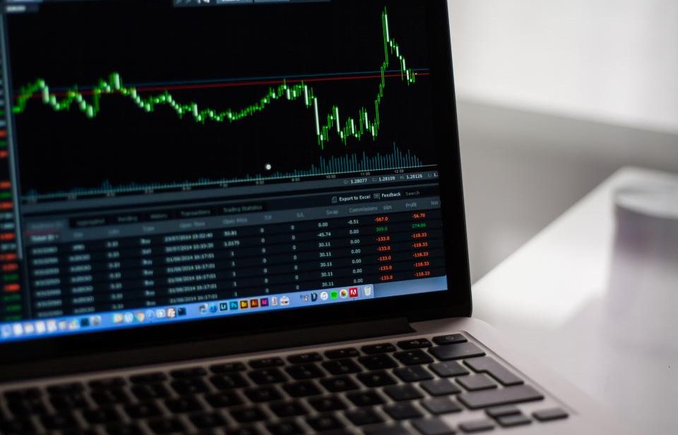
The first year I looked at candlestick charts, I learned almost nothing.
I want to say that plainly, because every candlestick guide I read back then sounded like it had figured something out that I hadn’t. The writers knew the shapes. The shapes had names. The names came with probabilities attached. And I sat there, forty browser tabs open, convinced that if I just memorized enough of them I would finally be on the right side of a trade for once.
I wasn’t. I was worse than a beginner. A beginner at least knows he doesn’t know. I had a vocabulary and no understanding, which is the most dangerous combination there is.
Then one afternoon I asked myself a simple question that I should have asked on day one: what is this thing, actually? Not what does it predict. What does it contain? And the honest answer broke the spell.
A candle is a receipt, not a prophecy
Here is the whole idea, and it fits in one sentence: one candle records four prices from one fixed slice of time.
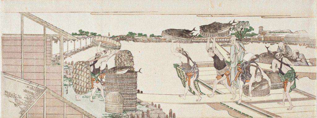
That’s it. That’s the entire invention. Somebody in eighteenth-century Japan got tired of watching a single number flicker and decided to draw the range of what happened instead. The shape is just a more compact way of writing down four facts. There is no hidden signal baked into the geometry. There is no mechanism inside the rectangle that reaches forward into the future.
Which means the thing you are staring at when you stare at a candle is the past. Always the past. It has already happened. It will never change. And here is the trick your brain plays on you: a picture of the past feels like a prediction, because the past is ordered and clean and the future is not. So you look at a neat green candle and your mind finishes the sentence for you — up next, obviously. Your mind is lying. The candle never said that.
I used to think I was reading the market. I was reading my own eagerness, projected onto a coloured rectangle.
The anatomy: four prices in one shape
Before the dictionary, the grammar. Get this wrong and everything downstream is guesswork.
Every candle covers one fixed interval — a minute, five minutes, an hour, a day, a week. The interval is a choice, and you make it. That choice matters more than most people admit, and I’ll come back to it.
Inside that interval, the market produces exactly four numbers worth drawing:
- Open — the price at the instant the interval started.
- Close — the price at the instant it ended.
- High — the highest price touched at any point inside it.
- Low — the lowest.
Now draw them. The thick part in the middle, the body, spans from the open to the close. The thin lines sticking out — the wicks, or shadows — reach up to the high and down to the low. That’s every candle ever drawn. A long body means the interval opened and closed far apart. A short body means it opened and closed near the same place, even if price ran all over the map in between.
Colour is the part that trips people up, and it trips them up differently depending on which country they learned in.
In most Western crypto and stock charts, green (or white) means the close was above the open — the interval ended higher. Red (or black) means the close was below the open. Simple enough.
But walk into a Chinese or Hong Kong or mainland market and the convention flips: red means up, green means down. Same candle, opposite colours, because colour is a cultural convention and not a law of nature. I have a friend who reads mainland charts every morning and he still catches himself double-taking on ours. So when you open a chart you didn’t build, look at the colour key before you read a single shape. You’d be surprised how often that one detail changes the whole story in front of you.
The shape dictionary
Now the part everyone sells you. Below is the standard catalogue — the candles and clusters that get named, screenshotted and posted. I’ve added a fourth column, because the honest part is the part nobody puts in the poster.
For each shape, there are two different things going on, and you should keep them apart in your head: what it literally shows (arithmetic, undeniable) and what people claim it means (a story, a bet, a tradition). One of those is a fact. The other is a hope with a logo.
| Shape | What it literally shows | What people claim it means | The catch |
|---|---|---|---|
| Doji | Open and close almost equal → body is a sliver | “Indecision,” a balance point, a coming reversal | It’s also just a quiet interval. In a range, most candles look like this and nothing follows |
| Marubozu | Almost no wicks → open and close sit near the extremes | One side was in total control the whole interval | Half the time it’s the tail end of a move, not the start of one |
| Hammer | Small body near the top, long lower wick | Sellers pushed price down, buyers reclaimed it → reversal up | Only “means” anything after a decline. Anywhere else it’s just a wick |
| Shooting star / inverted hammer | Small body near the bottom, long upper wick | Buyers pushed up, sellers slapped it back → reversal down | Same trap as the hammer, mirrored. Ignore where it sits and it tells you nothing |
| Spinning top | Small body with wicks on both sides | Churn, a pause before direction | A pause is not a direction. It’s the market doing nothing loudly |
| Bullish / bearish engulfing | The second candle’s body fully covers the prior body | The other side took over → trend change | Two candles is not a trend. And “engulfing” is a description of overlap, not a cause |
| Harami (inside) | A small body contained inside the prior big body | Momentum stalling, possible reversal | Very common. Common shapes are the easiest ones to find by accident |
| Morning star / evening star | A three-candle reversal sequence | A full handoff from one side to the other | Three candles out of thousands per day. You will see them everywhere and they mean nothing everywhere |
Two things I want you to notice about that table, because they’re the whole point.
First: the left column is arithmetic. Every entry there is true by definition. The right two columns are interpretation — inherited tradition passed down for a couple of centuries and dressed up as analysis.
Second, and this matters more than any single row: the same shape can appear in completely opposite contexts, and the context is the thing carrying the meaning, not the shape. A hammer printed at the bottom of a long decline is a different animal from a hammer printed in the middle of a sideways grind. Same drawing. Different world. The dictionary gives you the drawing and quietly drops the world.
What the shapes don’t prove
Now the section that never makes it into the nice infographic.
The patterns are descriptive shorthand, not mechanisms. A name like “hammer” doesn’t explain anything. It’s a label you stick on a shape you’ve already seen. The candle does not cause the next candle. The two events have a common cause — the actual orders people placed — and the shape is just the visible residue of that cause. Naming the residue doesn’t reveal the cause.
Timeframe changes the meaning, not just the scale. A hammer on a one-minute chart, next to a hammer on a weekly chart, are not the same object drawn at two sizes. The one-minute hammer is mostly noise — a couple of impatient orders in a thin moment. The weekly hammer is the summary of a war. If you don’t know which one you’re looking at, you don’t know what you’re reading.
On 24/7 crypto markets, long wicks are often liquidation artifacts, not “rejection.” This one cost me real money to learn. In a thin order book, one forced sell can cascade through the levels and print a long ugly wick in seconds — not because “sellers were rejected,” but because someone got liquidated and the book had nothing underneath to absorb it. The textbook calls that a rejection. The tape calls it someone else’s bankruptcy. Very different things.
A candle in isolation is close to meaningless. Volume and location do more work than shape. Where does the candle sit relative to the range it’s been in for a week? Is it printing on heavy volume or a trickle? Those questions are boring and they are the whole game. The shape is the decoration on top.
And the dictionaries are drowning in survivorship bias. The examples that worked get screenshotted and shared. The ones that failed get quietly deleted. Nobody posts the fifty hammers that led nowhere. So the catalogue looks far more reliable than the raw world ever is — because you are being shown a museum, not a sample.
I’ll say the last part plainly, because I’d rather be useful than popular: no single candle, and no single named pattern, is predictive enough to be a strategy on its own. If a shape were reliably predictive, someone would have automated it into nothing by now. Markets are machines for removing free money. The idea that a two-candle shape survived that process untouched should make you suspicious, not excited.
One candle = four prices from one interval
Green body = close above open · Red body = close below open · mainframe China / Hong Kong charts reverse the colours
What I actually use candles for now
After all of that, you might think I’ve given up on candles. I haven’t. I use them every day. I just use them for something smaller and more honest than prediction.
I use them as compression. A week of price movement squeezed into seven bars I can take in at a glance. I use them to see where price has been spending time — the clumps, the quiet zones, the places it raced through and never came back to. I use them to spot violence: a candle that is three times the size of the ones around it is telling me something happened, and that is worth investigating. Not predicting — investigating.
And I use them to read structure — the sequence, where the ranges sit, which highs held and which broke. The individual shape almost never matters to me anymore. Its position in the sequence is what I’m looking at.
The shift was small but it changed everything. I stopped asking what does this candle mean? and started asking what does this candle tell me about what just happened? The first question has no reliable answer. The second one is just curiosity, and curiosity is honest. It doesn’t promise me a return.
A candlestick is a compact record of what already happened. It is not a forecast. The pattern is descriptive; the story you attach to it is the part that can be wrong — and it usually is, right up until the moment you stop attaching stories and start reading receipts.
Read the chart like a historian, not a prophet. Look at what happened. Then go find the volume and the context that explain why. The shapes will still be there, and you’ll finally know what they’re for.
None of this is financial advice. Reading charts is not a system that predicts prices, and I don’t trade on shapes alone — nobody who lasts does.
Related reading: Uptober Is a Base Rate, Not a Law · A Jobs Report Moved Bitcoin. The Funding Rate Moved Faster.
(The End)


